INCOMPLETE DESIGNS ON YOUR ACTOR WEBSITE.

Build a smart actor website in 90 seconds! Click here to begin.

Incomplete designs on your actor website.

Actor Website sin #-8

Thou shalt follow through with thy designs

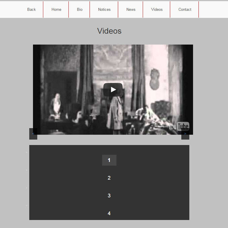
Incomplete designs on your actor website look unprofessional, and if people see anything like that it will be hard to unsee it. Let's take a look. There's a border on the right hand side of the menu, but nothing on the left. The video is shifted to the right making it look off-center. Navigation arrows are almost not visible the way they are positioned. Navigation buttons are huge (pronounce it like Donald Trump would pronounce it). Huge! and there are little white bullets on the left hand side. Just dark and gloomy.

Web For Actors Blog

The Timeliner

The Timeliner

12.31.2050 Template Tuesday
Check it out »
Industry Contacts version 1.2

Industry Contacts version 1.2

12.31.2050 Take control of your contacts
Check it out »


Showcase your work with a free website

Niche professional websites for people in the film and TV industry.

Weeee, you found me!

I'm your buddy Bottie, I was hiding behind the scenes, but now that you've found me I'd be happy to tell you what I'm doing.

Actor Website helper: Bottie

I just wrote a few fun facts about Web For Actors

Would you like to take a look?
Click here to check them out. I hope it will cause involuntary audible response.